all projects


Role: UX Designer Tools: Figma, Adobe Photoshop Team: Cailey Booze and Mo Touman (Mentor) Timeline: 5 Days (Sprint)
Enriching the Act of Looking at and Connecting with Art
Context
GalleryPal is a start-up that is looking to improve the in-person experience that users have viewing art in a museum or gallery.
The problem
While many museum visitors enjoy exploring galleries on their own, this often means they miss important details and context, limiting the depth and richness of their experience.
The solution
I have designed an application that utilizes AR and storytelling that allows the user to use while they are viewing art in galleries, to guide their own understanding and understand the artists intent more.


The Current Situation
People generally prefer to engage with art solo and viewers often know nothing about the art or the exhibits before they arrive.
Sometimes I'll do a quick Google search for a painting while I'm on my phone while I'm at the museum... but I usually just find long articles that are super overwhelming."
Lola T.
I enjoy looking at art, but sometimes I feel like I'm missing out of the full experience by not knowing any background information or context."
Al M.
I like to form my own opinion about art, but it can be hard to do that when I don't really know anything about the artist, or what their intentions were in creating the work."
Kim B.
This leads me to three key insights: Viewers...
-
Feel like they don't have context and missed something.
-
Prefer to be independent, but would like to know more.
-
Are overwhelmed by too much information.
How might we... find a way to further inform viewers about art exhibitions while allowing them their independance?
Day One: Research and Mapping Insights
Journey Mapping
I started with mapping out the intended journey of GalleryPal users. I started with "Viewer", and ended with "Learn about Art", as that is my main goal with GalleryPal.
A big focus for the experience was making sure visitors walked away with some solid context about the artwork. In my interview with Lena Carroll, museum curator and gallery worker, she shared that her main goal with viewers is to help people form their own interpretations and stories, and that really only happens when they've got the background info to build on.


Day Two: Ideation and Inspiration
Lightning Demos
I explored a couple different applications that had a similar function to what GalleryPal is aiming to execute.
Google Arts & Culture
A free website and app by Google where you can explore art, museums, history, and culture from around the world.
-
It lets you see famous artworks and museums online
-
You can learn about artists, historical events, and cultures
-
You can take virtual museum tours without traveling

NYC360
An interactive virtual experience that lets users explore New York City in 360-degree views.
-
It allows you to look around NYC as if you’re standing there
-
You can explore landmarks, streets, and neighborhoods virtually
-
Users can learn about the city’s architecture, history, and culture without being there in person
-

I loved the use of AR and the method of storytelling that these applications used.

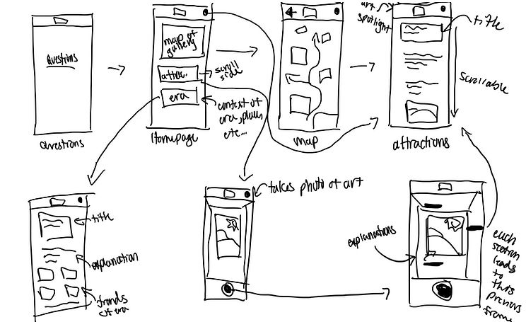
Crazy Eights Sketching Exercise
I utilized this exercise to rapidly generate different ideas and solutions for the GalleryPal application, keeping in mind the analysis of the two apps above. These quick sketches were of:
-
A "storybook" of each section of the museum that provides context into each art era.
-
The camera on the mobile device photographs art and provides an explanation into the artist's work.
-
Headphones to hook up to the mobile device and walk around with so that the viewers can listen to descriptions of arwork.
-
A map that is interactive and helps the viewer find different pieces of art, while highlighting the most popular.
-
A guestionaire of what the viewer wants to see, and the application will guide them around the musuem.
-
The camera on the phone will provide "floating explanations" on the UI screen, and highlight "easter eggs" in the artwork.
-
The camera will have an AR/VR experience that will allow the viewer to see things in the museum that are not actually there, and correlate with the artwork and the era.
-
The application will correlate with the museum location and show what the most popular attractions are at that museum.
Selected Idea
After careful consideration, I decided that the best solution for GalleryPal would be to combine multiple ideas. To best fit the users of GalleryPal, I combined the concepts of the use of AR/VR camera, interactive maps, photographing the art, and descriptions/information regarding the exhibitions.

Day Three: Making Decisions
Storyboard
This was the day that I solidified my design direction. Below is a more in depth sketch of what the solution for GalleryPal will look like. This is where the major UI components started to come together.
I iterated further on the solution sketch to come up with the below storyboard layout. Initially, I wanted to add a customization quiz, but upon further ideation and brainstorming, I deemed it unnecessary.

Day Four: Bringing Solutions to Life
Initial wireframes
I created a set of wireframes, using Figma, for the red routes of GalleryPal.


Day Five: Testing and Discovery
User Testing
I conducted four moderated user tests with the low fidelity prototype. Here, I am testing for ease of function. Throughout my user tests, there were many recurring patterns and themes.
I have found that using AI to synthesize research findings is a fantastic way to help synthesize research, and it helps save a lot of time. I wanted to utilize this approach, and I thought it was the perfect approach for a design sprint like this one. I organized all of my user testing notes, and synthesized the information into reoccurring patterns and themes. The results are listed below:
-
UI Is Clean, Simple, and Approachable
-
Bottom Navigation Icons Are Confusing
-
Information Hierarchy Is Backwards on Painting Details Page
-
TL;DR vs Deep Dive Is Highly Desired
-
Camera / AR Feature Is the Strongest Feature
-
Navigation & Wayfinding Issues
75%
of interviewees expressed a need for short summaries with the option to explore deeper content.
100%
of interviewees stated the bottom dock icons are confusing and makes the app hard to navigate.
75%
of interviewees stated they wanted to see subject matter or context first.
75%
of interviewees stated the AR and camera feature was the best learning tool
Implementing Changes
I added a toggle function to the artwork descriptions, with "read more" and "read less" options. I also changed the content layout to show context or subject matter first.


.jpg)
.jpg)
I changed the icons on the dock to fill solid when the user is on that page, and I also added descriptions underneath.
I also changed the overall layout of the homepage to differentiate the sections, and limit confusion.


.png)
.png)
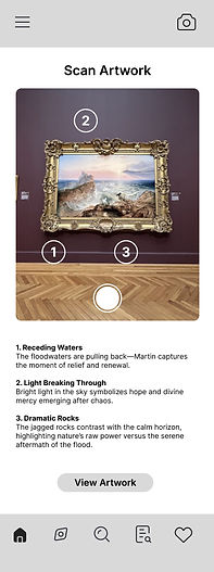
I changed the layout of the camera page to limit confusion. Many users did not understand the function of this page, so I added a title, and added a toggle feature to the photo.
Many users thought the numbers were too big and covered the painting, so I minimized them.
.jpg)
While there were no usability issues regarding the tours scheduling page, I decided to clean it up along with the rest of the application. I added a calendar to make it easier to see dates, and fixed text hierarchy and visual design issues.

.jpg)
The Finished & Final Product
After much iteration and testing ideas, I would like to introduce the finished final product!


Final User - Experience
Thank you for taking the time to view my case study! Check out my work from Sabre here.